From the Archives
Brand Identity Design
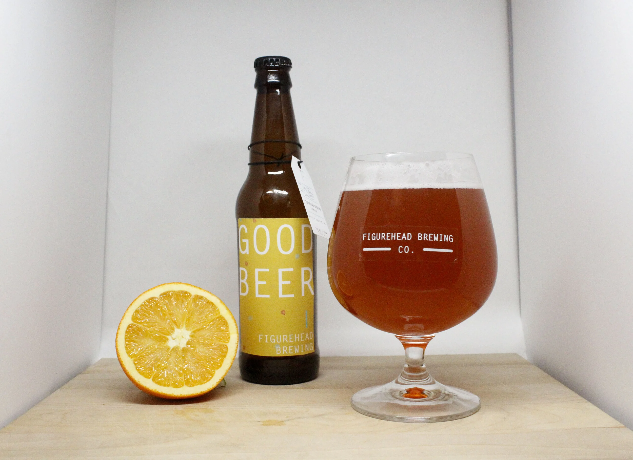
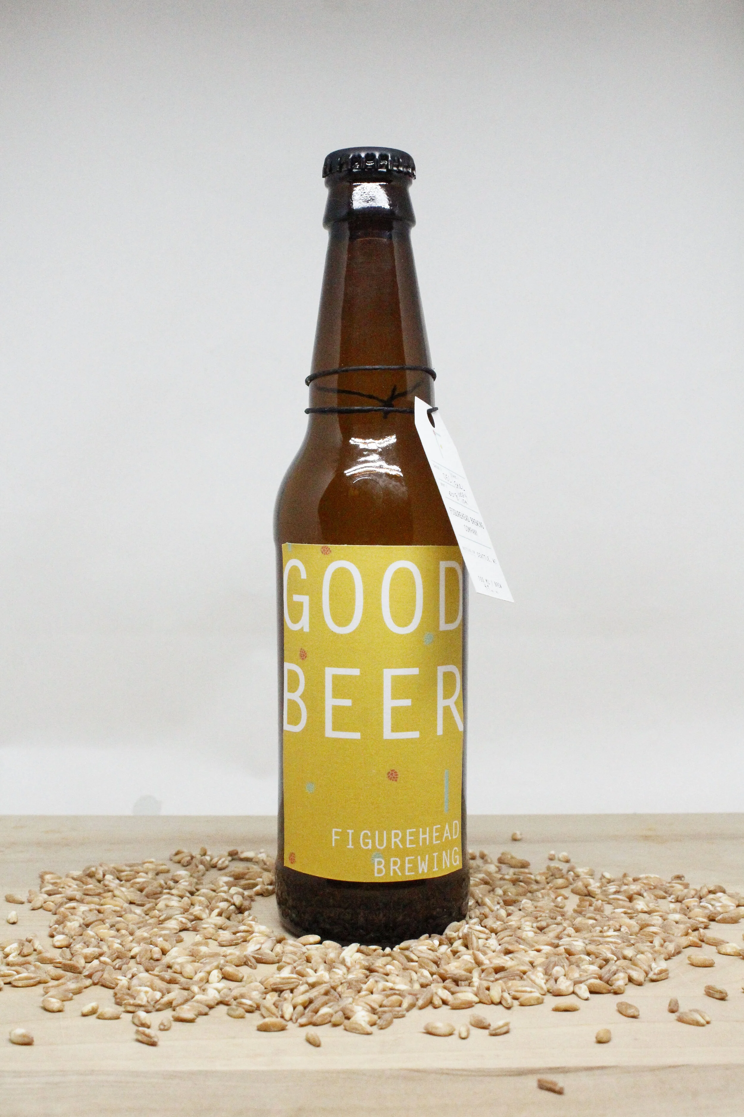
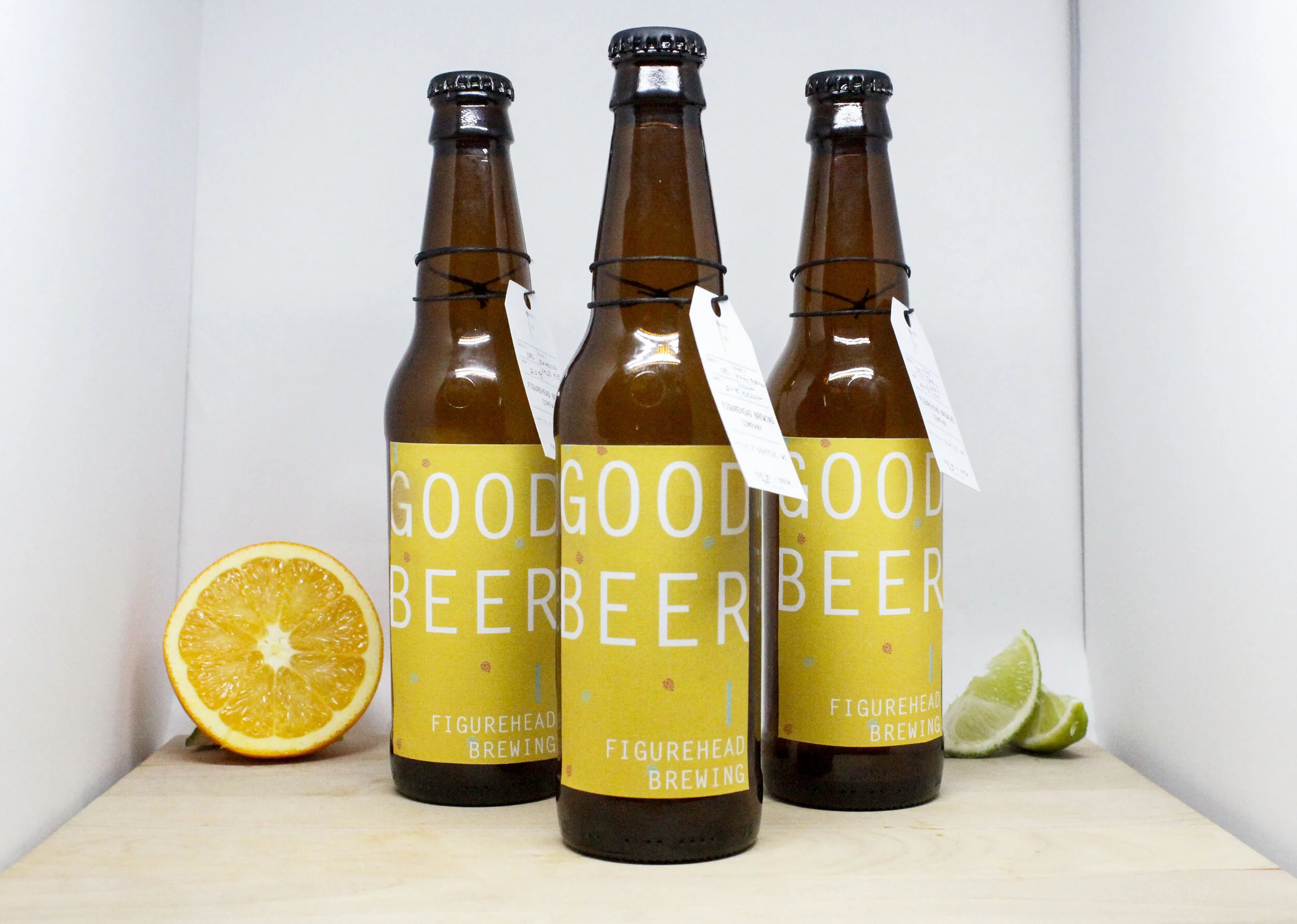
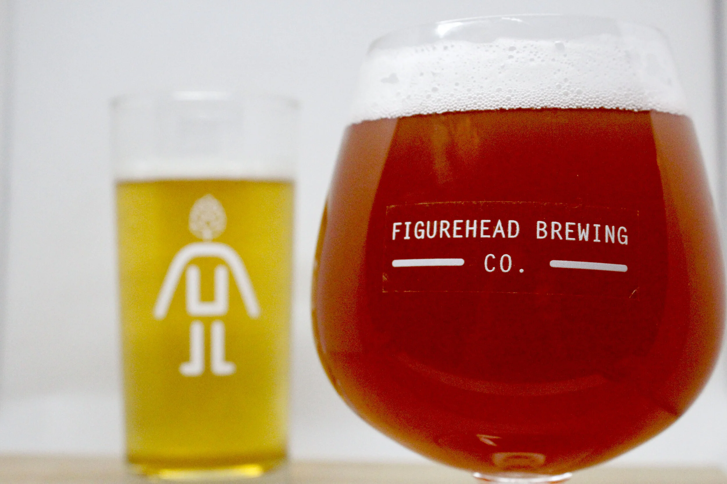
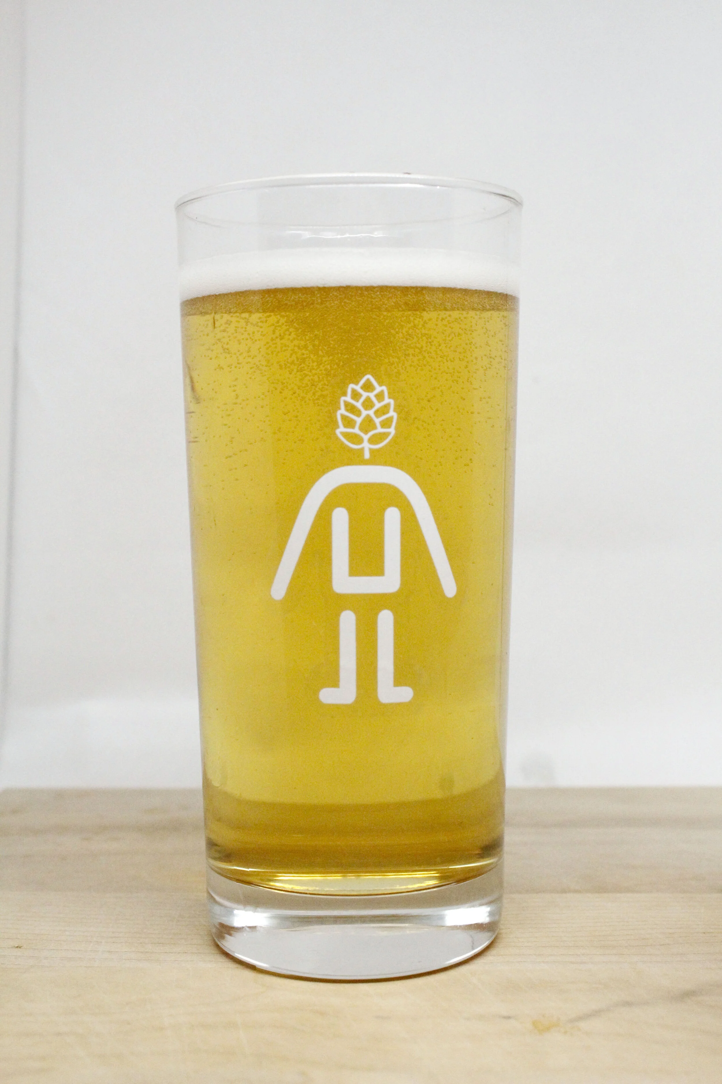
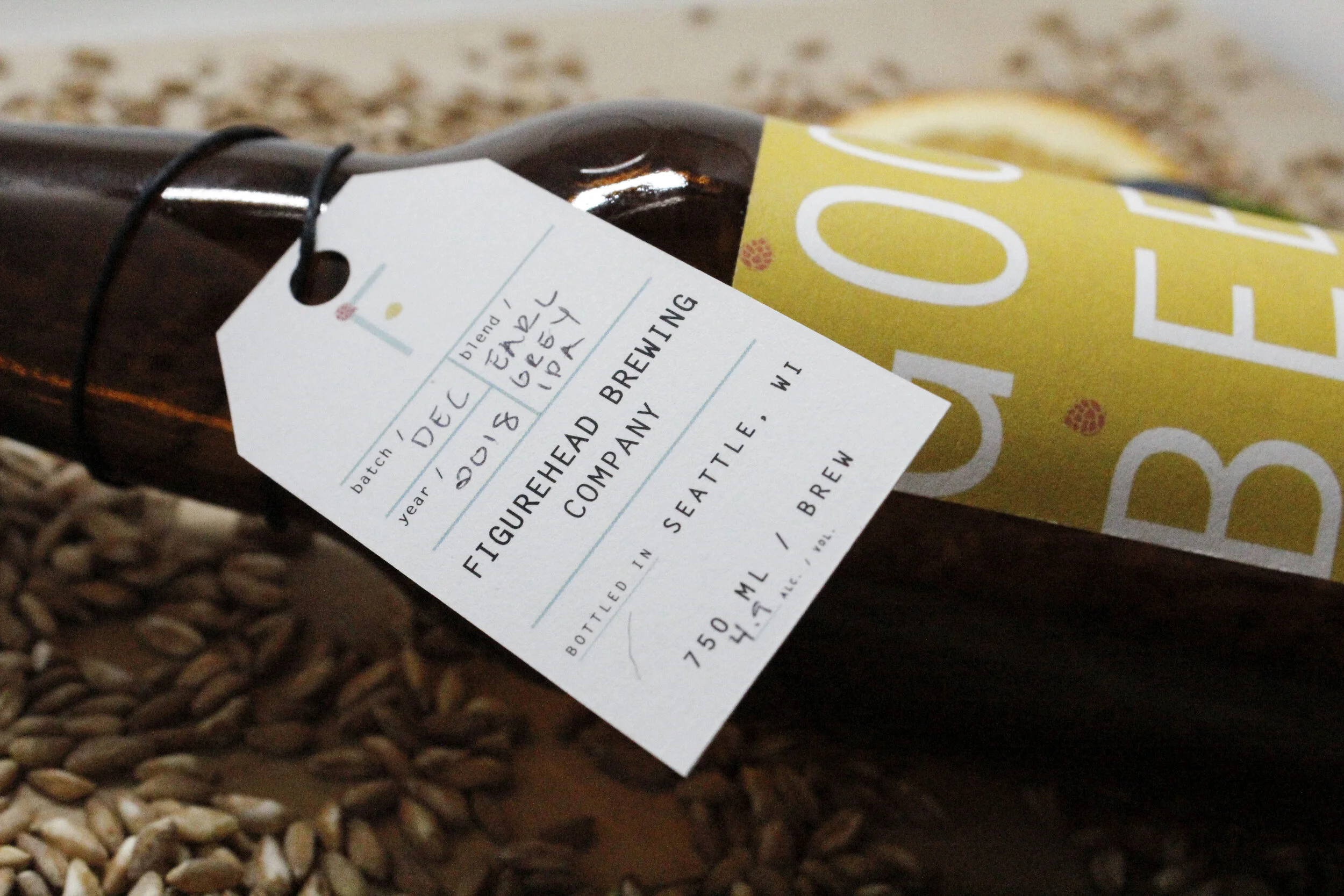
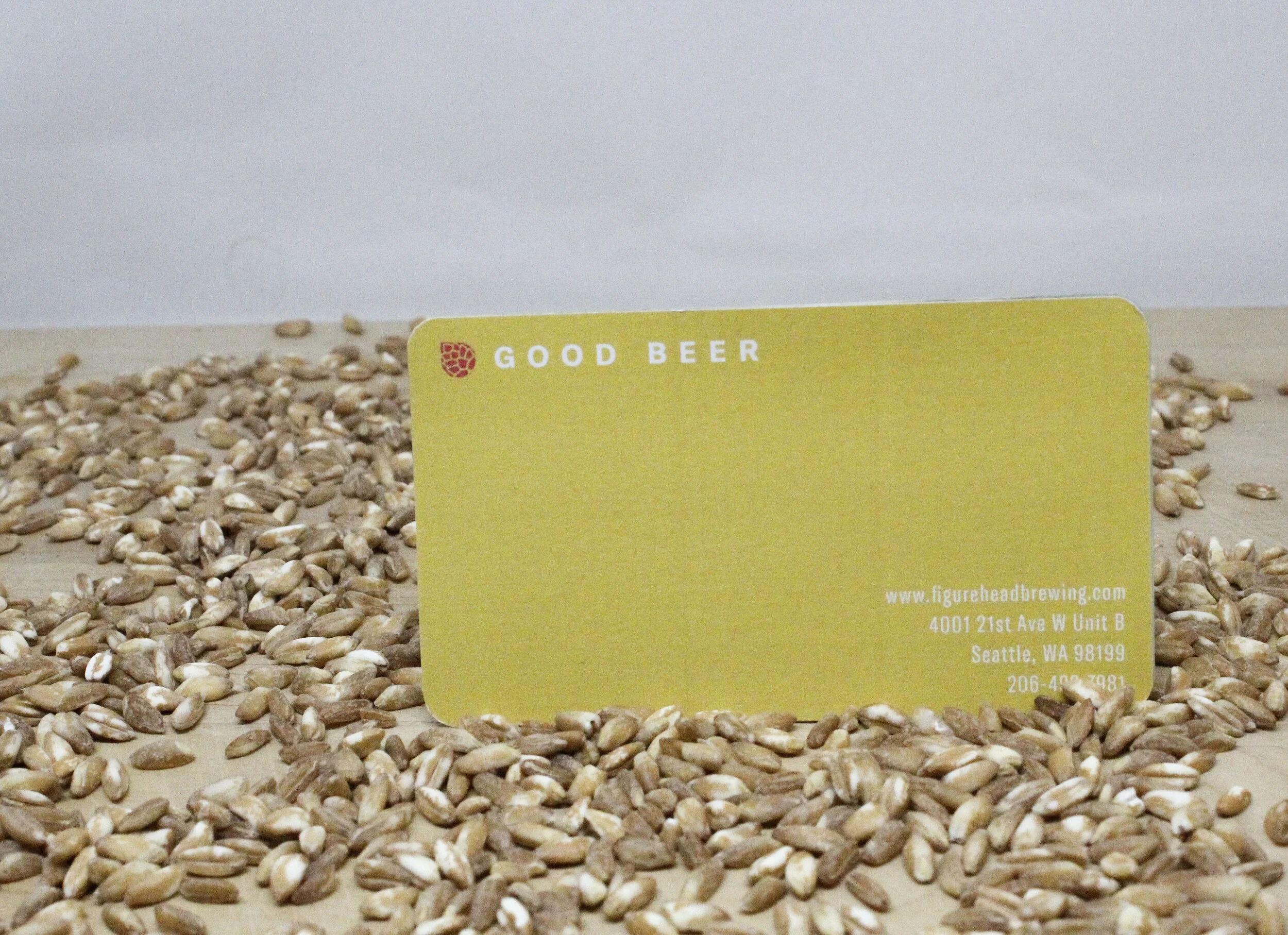
2018Figurehead Brewing Company
For this project i re-vamped the design for Figurehead Brewing from head to toe. This brewery is based in Seattle, Washington and at the time was just a starting-up business. They still had not developed an identity through design, and I was happy to oblige.
A new logo was applied along with new business cards, stickers, and menus. This playful yet simple look matches the fun personality of the brewery and helps buyers place a logo to to the name + will help drive in sales.


Brand Identity Design
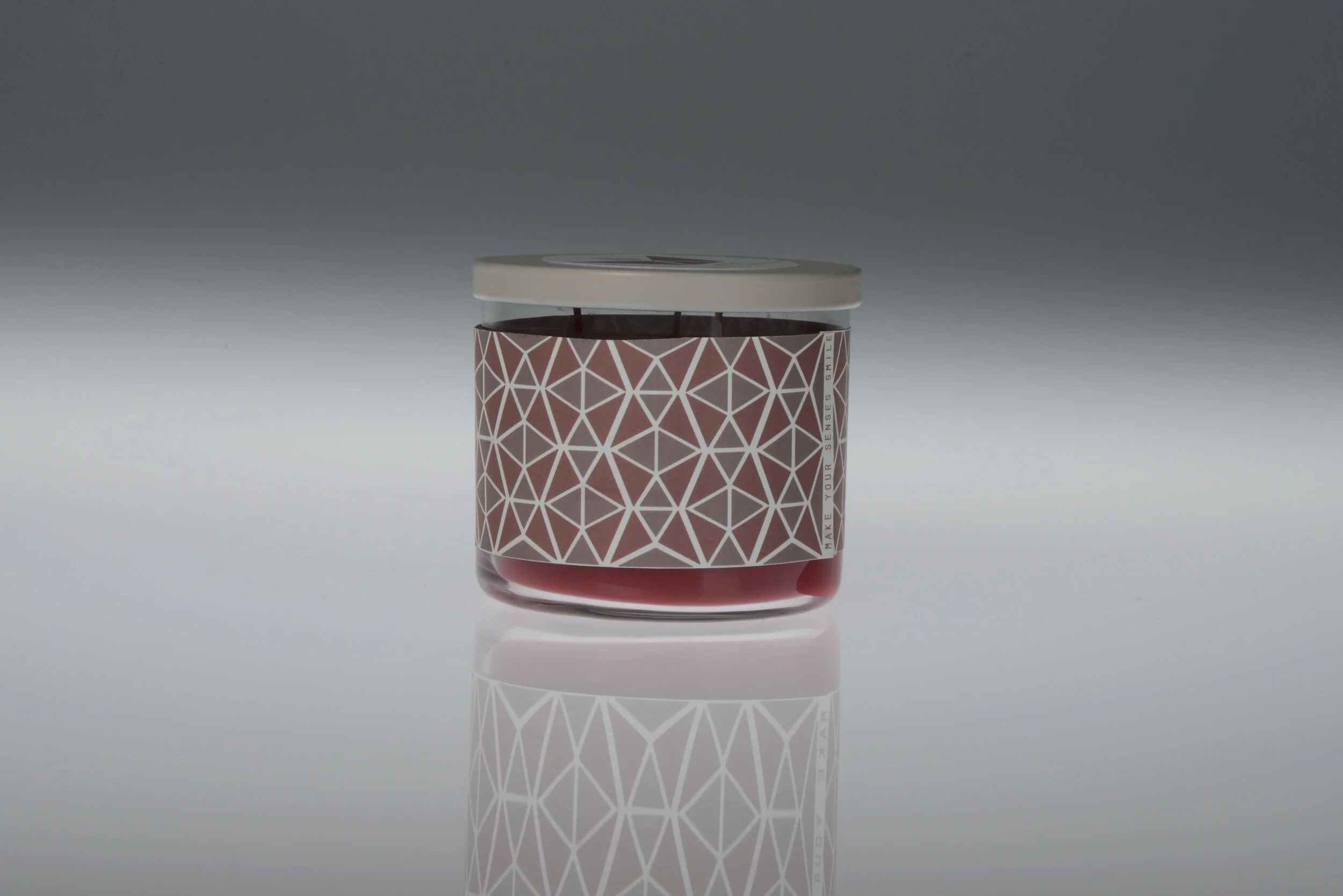
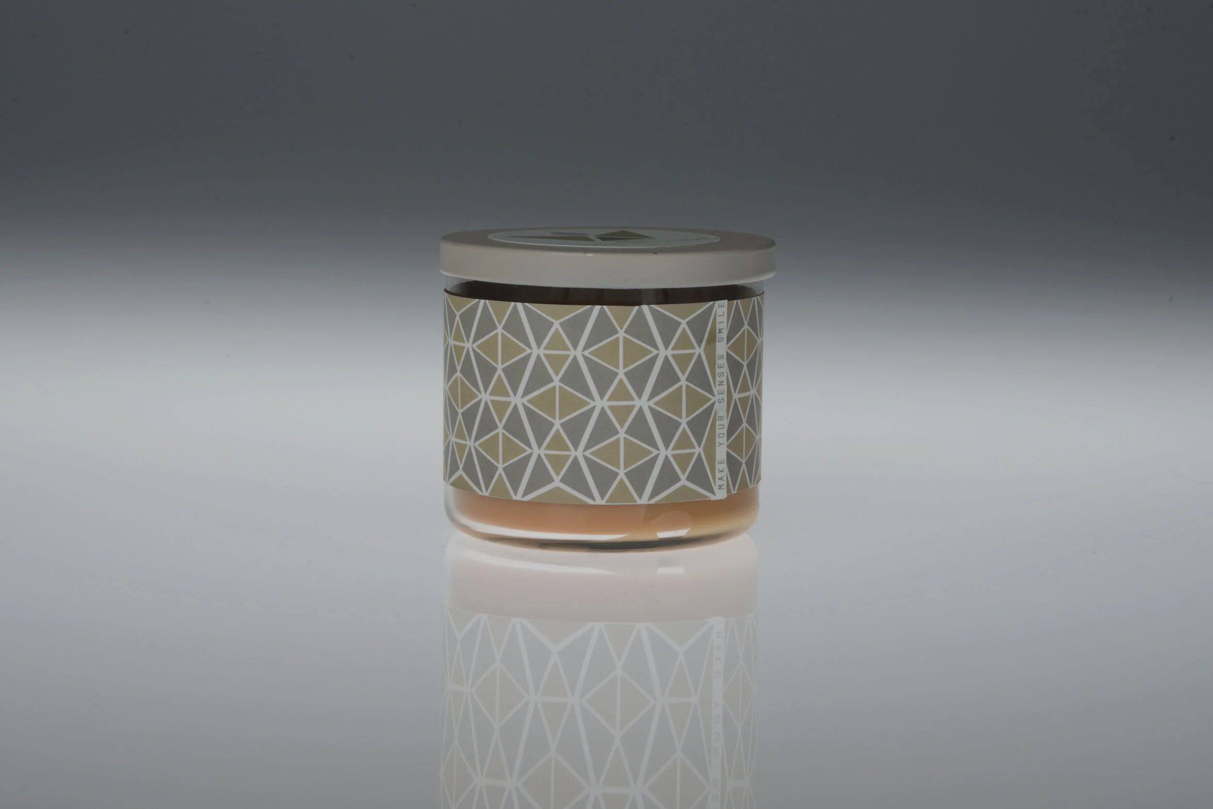
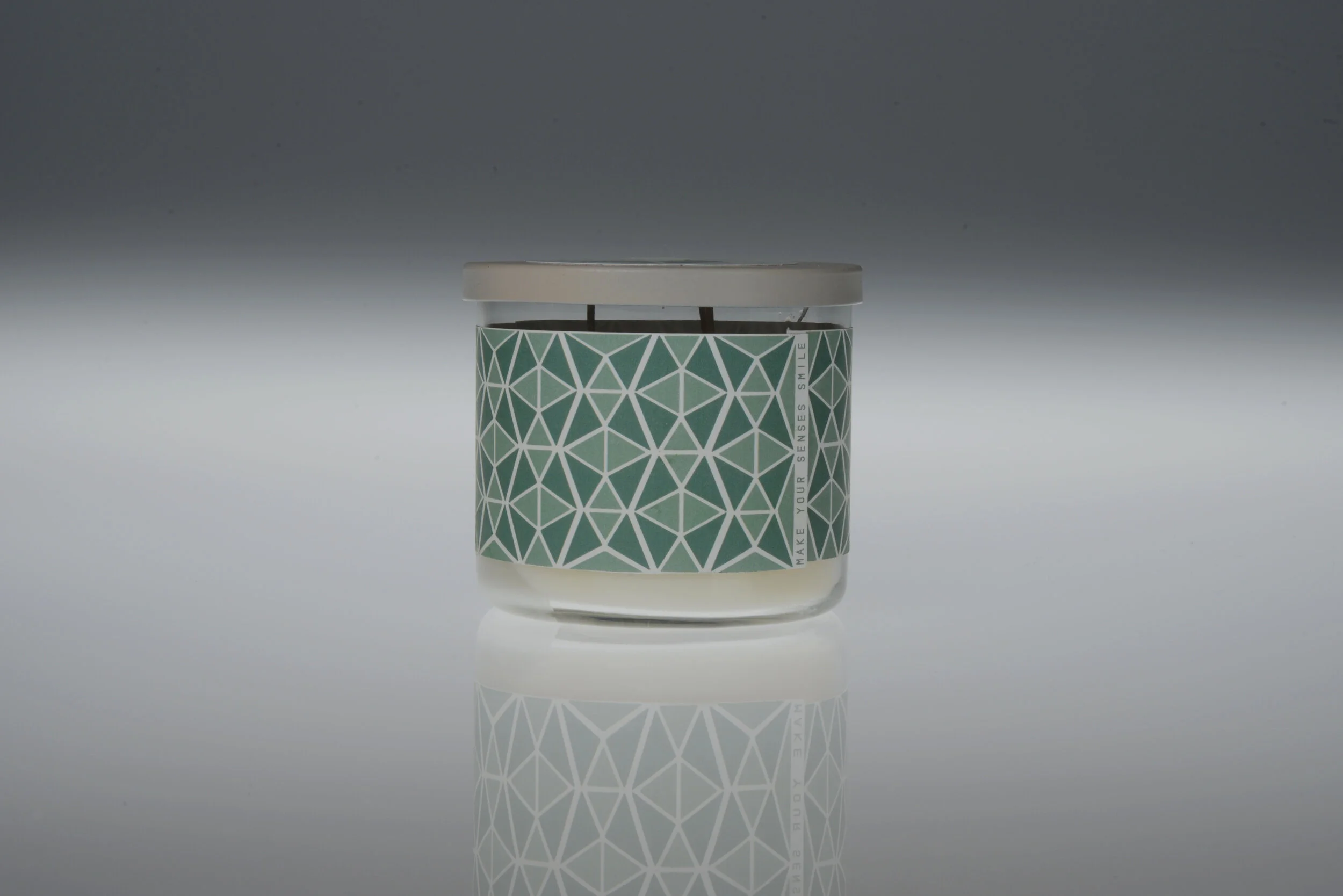
2017Whiff Candles
This project was a full Re-design of a product of our choice. I chose to re-create the Mainstays candles sold at any local Walmart.
The photos of apples and vanilla cupcakes are in the past, and I created a cohesive design system that the brand can use for any candle scent. My goal was to take a creative and playful spin on the branding of the candles; creating an object that could sit on a table and still be enjoyable to look at. Introducing Whiff Candles; make your senses smile!


Wayfinding Design
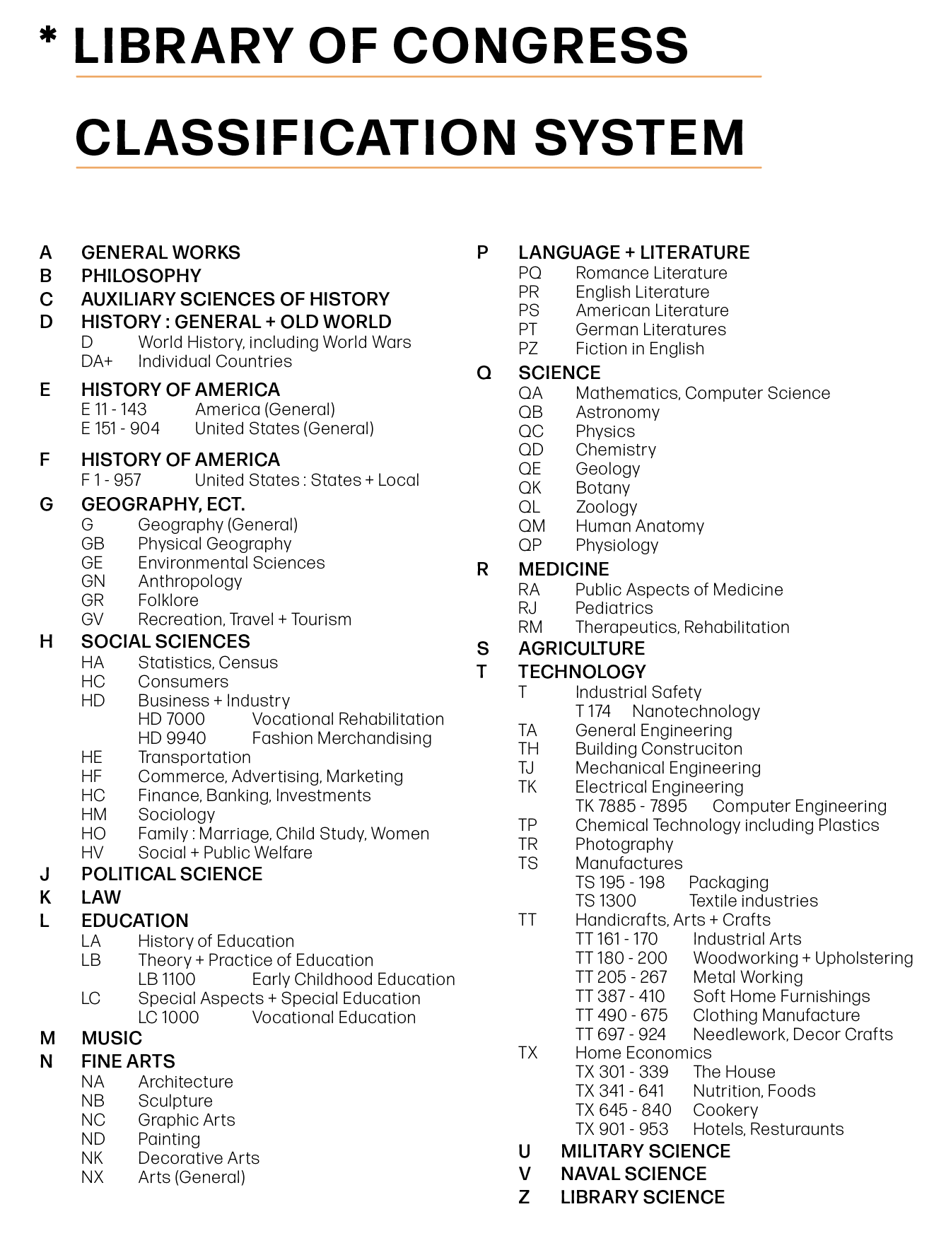
2020UW-STOUT Campus Library
The objective of this project was to re-vamp our school library; help it show personality and promote healthy work ethic. This project serves as the perfect example of a design challenge that gives purpose to an under-used and ignored space.
The goal was to effectively use various way-finding elements to help communicate the complex nature of the space. This includes proper signage for direction, categorization, and communication.
This make-over will enhance the space and bring a playful, yet composed, personality to the Robert S. Swanson Library and Learning Center. After this re-design, the campus library has potential to be a thriving, functional public area where students can gather together as a community.


Publication Design
2019This is a re-design of the 2018 Annual Report for the eye-glass company, Warby Parker. My goal was to create a playful twist on the formalities of a traditional annual report.
I chose to portray the energetic essence of the Warby Parker brand through playful illustrations supported by a bright color palette. To create this publication, I used Adobe InDesign, Adobe Illustrator, Adobe Photoshop, and Procreate.
Throughout this project I learned the importance of leading, kerning, and type size along with how big of a difference paper types can make.


